Differences in rendered images for different colors?

I am working on a project where the client would like many images of different garments all to be lit the same way. I 'perfect" the lighting in one garment in a specific color, but when I go to a different garment in a different color, using the same HDR Environment Map & .vpl lighting file, the images are COMPLETELY different looking, very washed out. Is there any way to adjust this, or do I need to adjust the lighting for every garment, every color, every fabric?
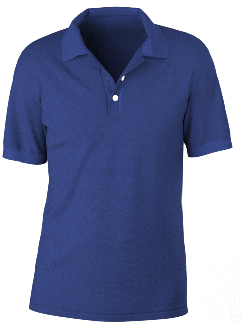
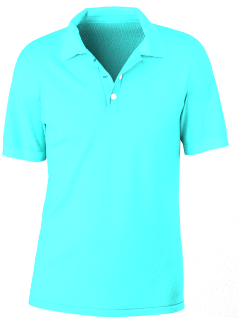
first image is a deep navy/cobalt, second is a mid-turquoise
-
Hello, mary I think you have to set up the lighting for each color at least.
you said that you have saved the .vpl file so I suppose the setup is the same. Has the mid-turquoise t-shirt the same fabric set up? It looks a little more reflective/shiny
Daniele.
0 -
Hi Daniele,
The only thing I changes was the color. TY!
0 -
You may need to calibrate your scene properly and do it with the correct neutral (no shine) fabric or you will quickly get into a big mess with exposure and color swings all over the place - and the goal in shooting many colors is continuity for post color work - if you over expose a scene you will get less usable renders for some colorways in your batch render process. So some prep work for some basic scene exposure setups (3) is well worth the effort.
TIPS
There is a auto-focus and scene exposure tool in the camera settings. You can also set this manually if you want for more control. You need to stay aware of the > image area and the fabrics color value relative to auto-exposure or manual exposure.
Note that colorway (Fabric) and scene <camera> setup are mutually exclusive so this is an important issue when doing batch color shots, where the color tonal shift on transparent backgrounds sets the overall color value for exposure - therefore you can use the advantages of the physical camera - just like a real life studio setup for photography.If you have experience of fashion camera shoots this is basically the same, so that is an easy real world shift into the digital space if you are used to these camera values.
When you create a rendered image (with a clear background) you need to consider the entire frame of the shot for the averaging of the exposure value. THEREFORE when doing batch render colorways for garments when using a transparent background the shirt fabric color forms the entire image value (the fabric color) for the batch image exposure. This means you should NEVER choose a dark fabric as your baseline garment to set your transparent exposure value within your scene - use a mid grey value for RGB and then expose the frame for that color shirt. Then split your garments based on the fabrics shade of color and exposure for that tonal shift tolerance. Eg: light colors, Mid colors, dark colors. I often have my color balance card as a 2D graphic I place on the garments like a big frontal screen print for this task and then just erase that from the scene for my spot checking for the exposure before I run the final shots to render as a batch. Then you can batch 3 runs for exposure that works for colors that sit within the tolerance swing of light, mid, dark fabric colors and keeping the white balance about right - you can always tweak that a little further later in post image work.
If you render scenes with a background the exposure will encompass the background so you need to stay aware of the area that is being calculated to determine the exposure in a batch run of images.You can try switching off the exposure setting in the camera setup, or (like I prefer to do ) you can manually do this for light, mid grey, dark fabrics. Here I set a baseline Matte fabric with no gloss, no normal, just flat mid grey using the color picker to my color chart (you could also have these as a custom palette (swatch) saved to your color picker (which is how I usually save that set of RGB values). Once you have that grey fabric on your garment with a transparent background > set the physical camera to the exposure settings you want, and also the white balance again using the color picker onto the color chart, now that range of mid grey (colors) should be within reasonable color shift tolerance for that render exposure batching the HDRI and light setup for your scene. Do the same for light colors (a base light fabric - not pure white as nothing is pure white eg: your sky blue shirt) and then for dark fabrics like your navy or reds. White spot balance for all tones on the white value in the grid and you should now have 3 color balanced scene setups you can drop a fabric into without too great a swing on the exposure - you should read up on that via the vray website.
Switch on the physical camera to set the white balance for the exposure etc. Click the white balance swatch in the property editor to bring up the color picker, then spot check the white grid (for the 2D color checker I loaded in as a makeshift scene color checker card) so it re-balances the white for that image exposure. To get a fabric color in my scene that is mid grey I simply open up the fabric and use the color picker to change the base color to my grid mid grey.

That's all there is to it. Pretty simple even when doing it manually. Set your exposure for the range of colors using a few calibrated setups. And you should get better color and render image consistency in future.
0 -
Thanks SO much ottoline ! I will review all of this today and let you know how it went. Please don't delete your post just yet :) I want a colleague that I am working with (the photographer) to read this as well.
0
评论